Mercury Walch
Website and Brand Refresh
Mercury Walch is at the top of the Tasmanian printing industry, with a reputation for providing timely and quality service for the last 20 years.
Mercury Walch approached Neon Jungle to undertake a brand refresh to coincide with entering their third decade of business, with a clear set of objectives for the new brand.
After years of building a loyal customer base, it was important to the organisation to break any lingering perception that being 'big' means 'impersonal', 'unapproachable' and 'elitist', and really lean into their key strengths — relationship-building, industry experience and adaptability. Sustainability has also become a core focus for the organisation and needed more prominence in their brand narrative.
Taking note of these objectives, we sought to create something that spoke to their values of being approachable, knowledgeable, tech-forward, sustainably minded and capable.
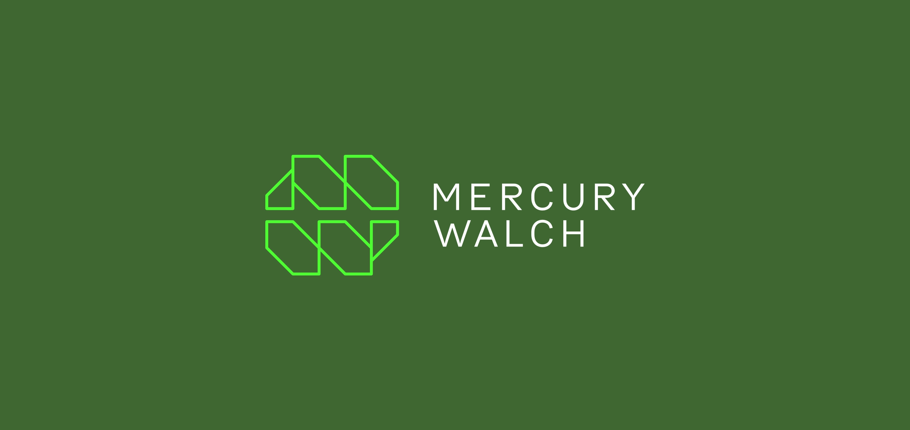
The result is a brand that feels modern, familiar and dependable and keeps in step with their historical use of the MW lockup.
The almost interlocking, mirrored letters of the MW lockup conjure up images of printing press machinery, emulating a sense of strength, reliability and precision. The Bull-5 typeface we selected subtly nods to historical typewriter fonts, giving a nostalgic and friendly feel to their modern logo.
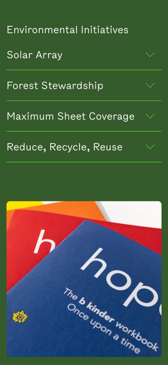
Although it can often feel like an obvious choice for a brand with sustainable intentions, we decided to continue using green as the brand's primary colour. The olive green paired with its neon counterpart is modern, striking and memorable. The final brand says loud and clear that this organisation is ready to adapt to the future of printing, ready to serve for another 10 years.
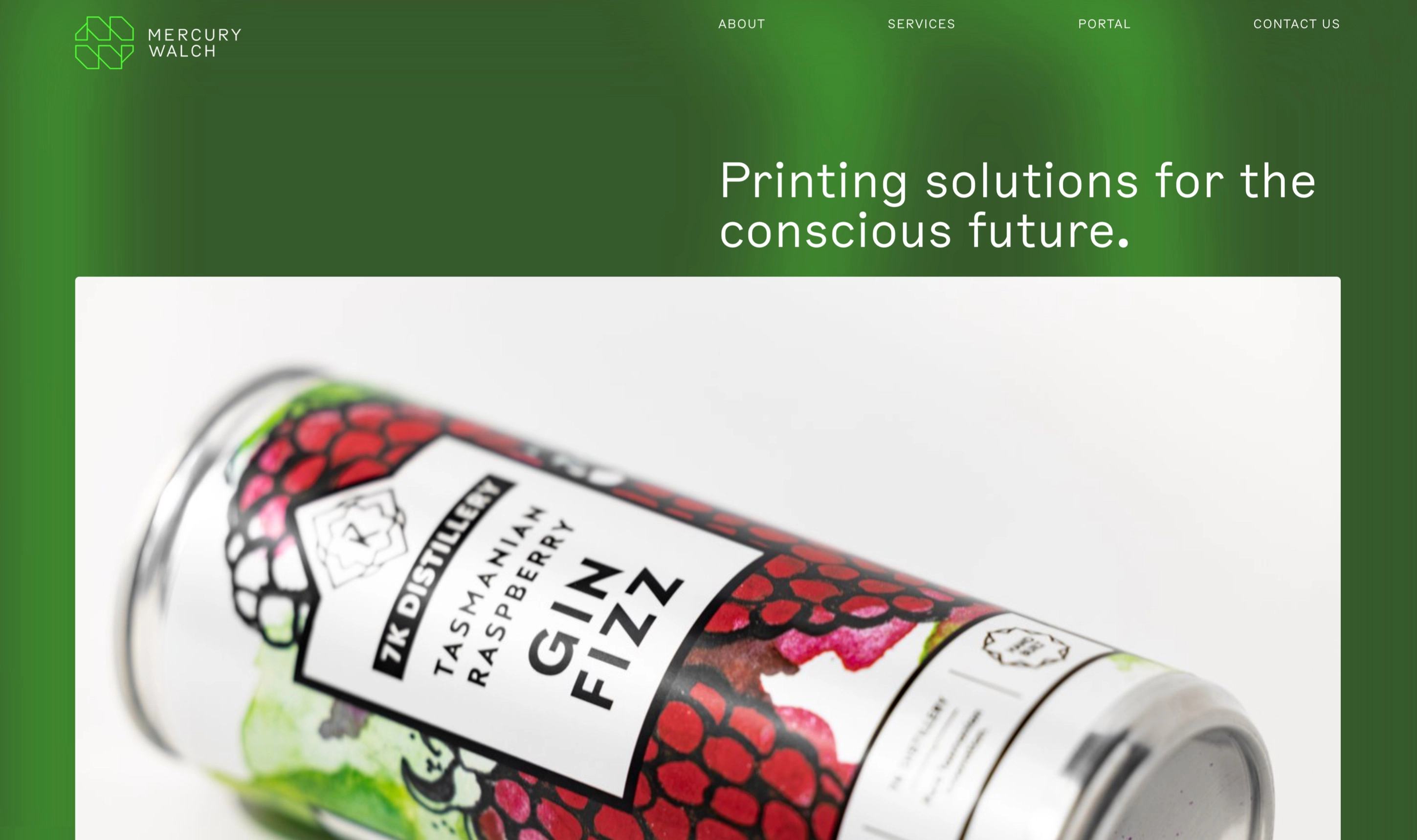
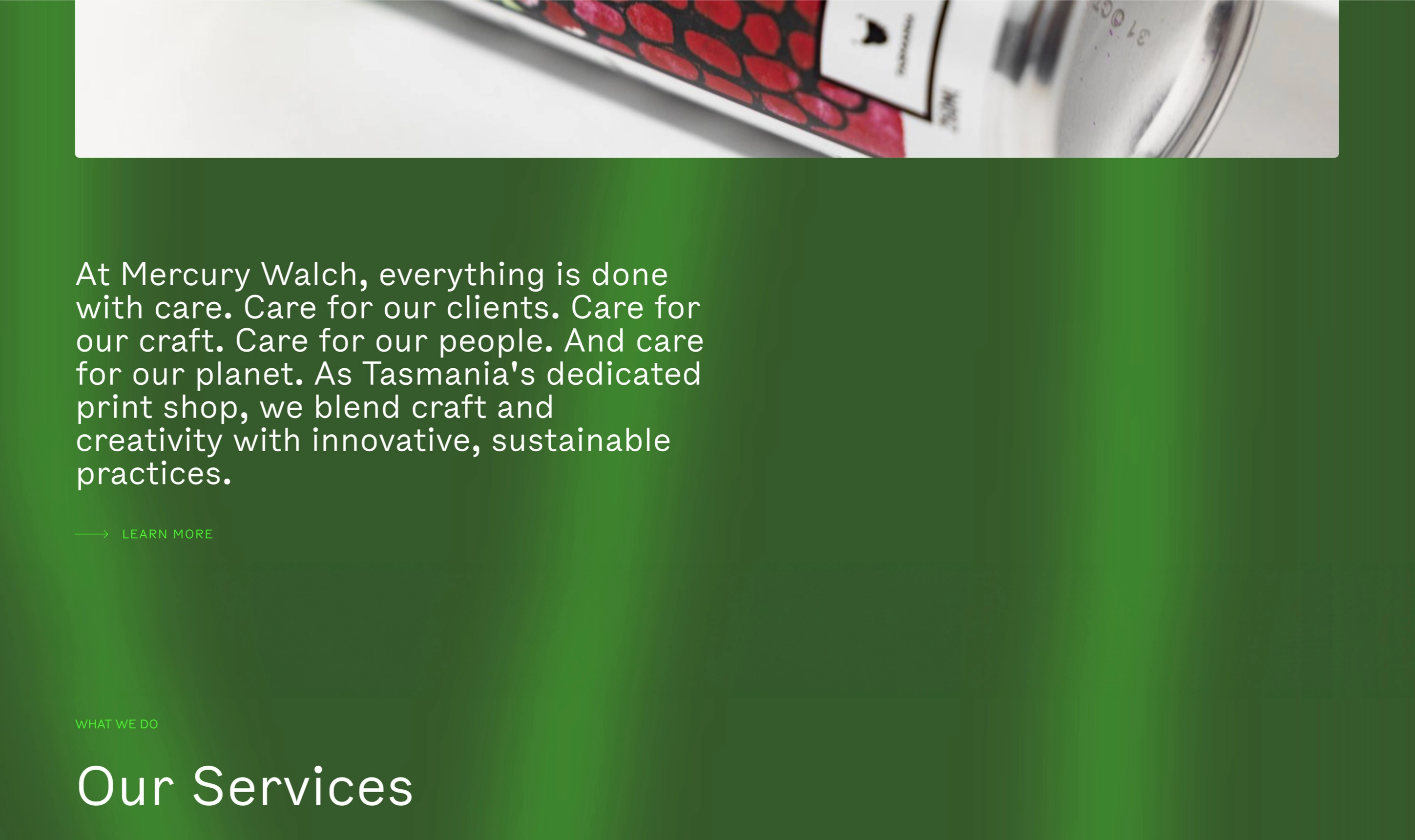
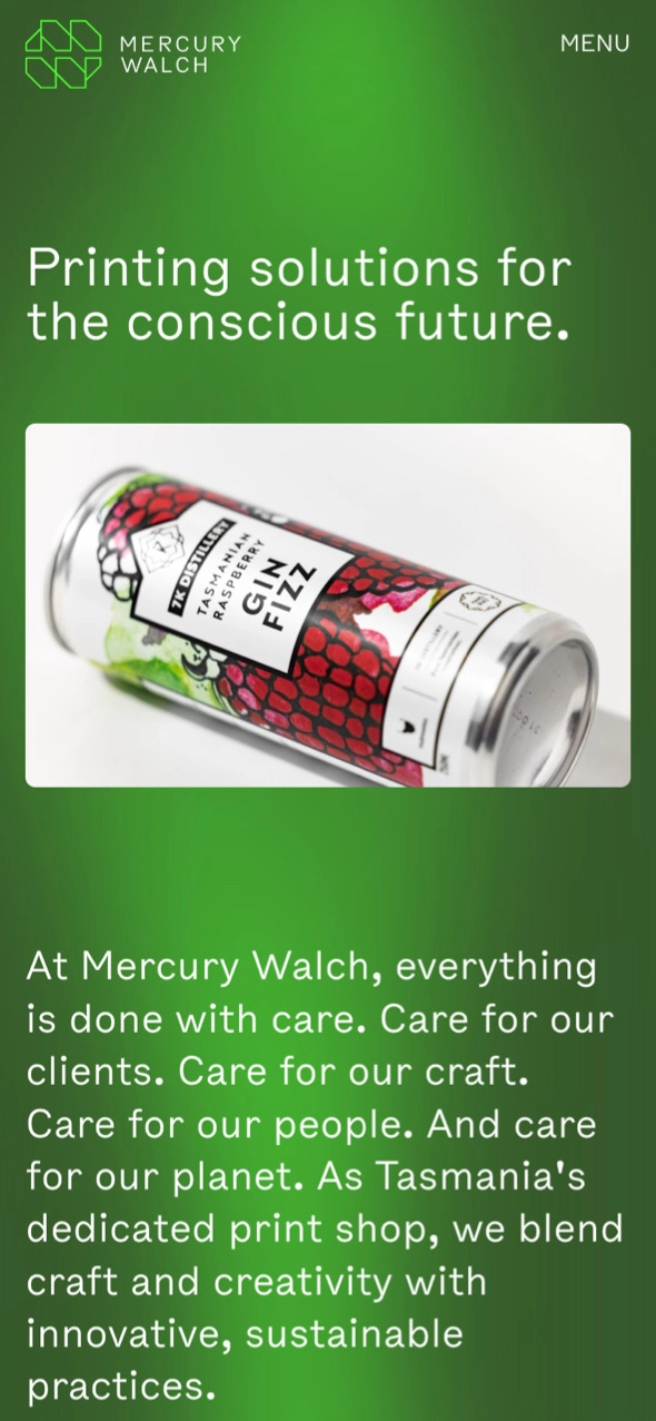
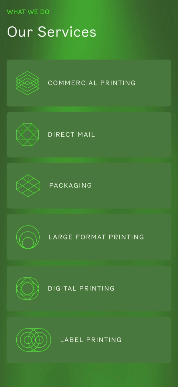
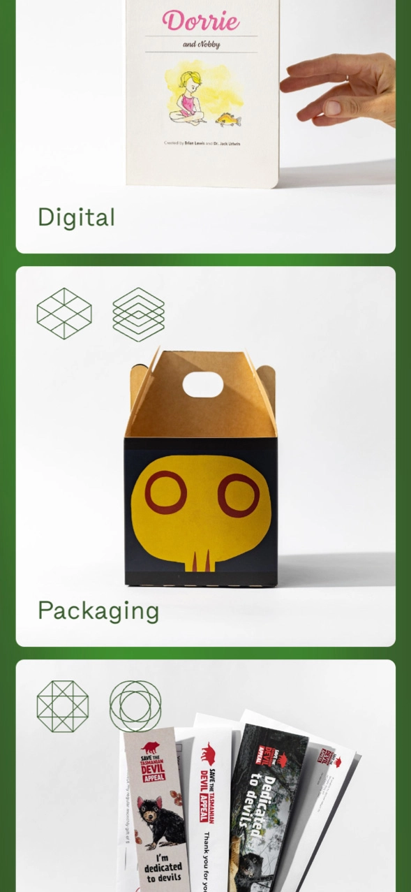
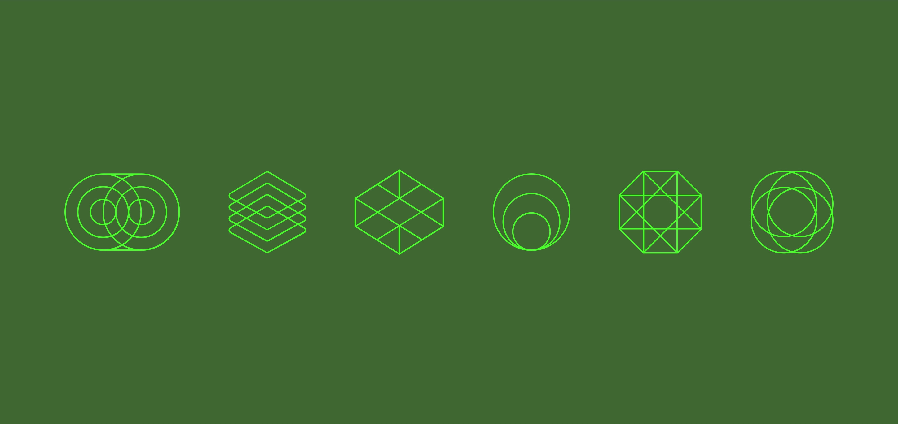
Following the rebrand, we built MW a new website that really lets their new brand sing. With a focus on showcasing the best of their work across their six service areas, the website leans into big, beautiful photography. We created a suite of service icons to represent each area of the business which are used across case studies on the website, but also extend to the signage used in and around the MW print warehouse.
Services
- Web development
- Branding
- Graphic design
