CoreMarine
Website and brand refresh
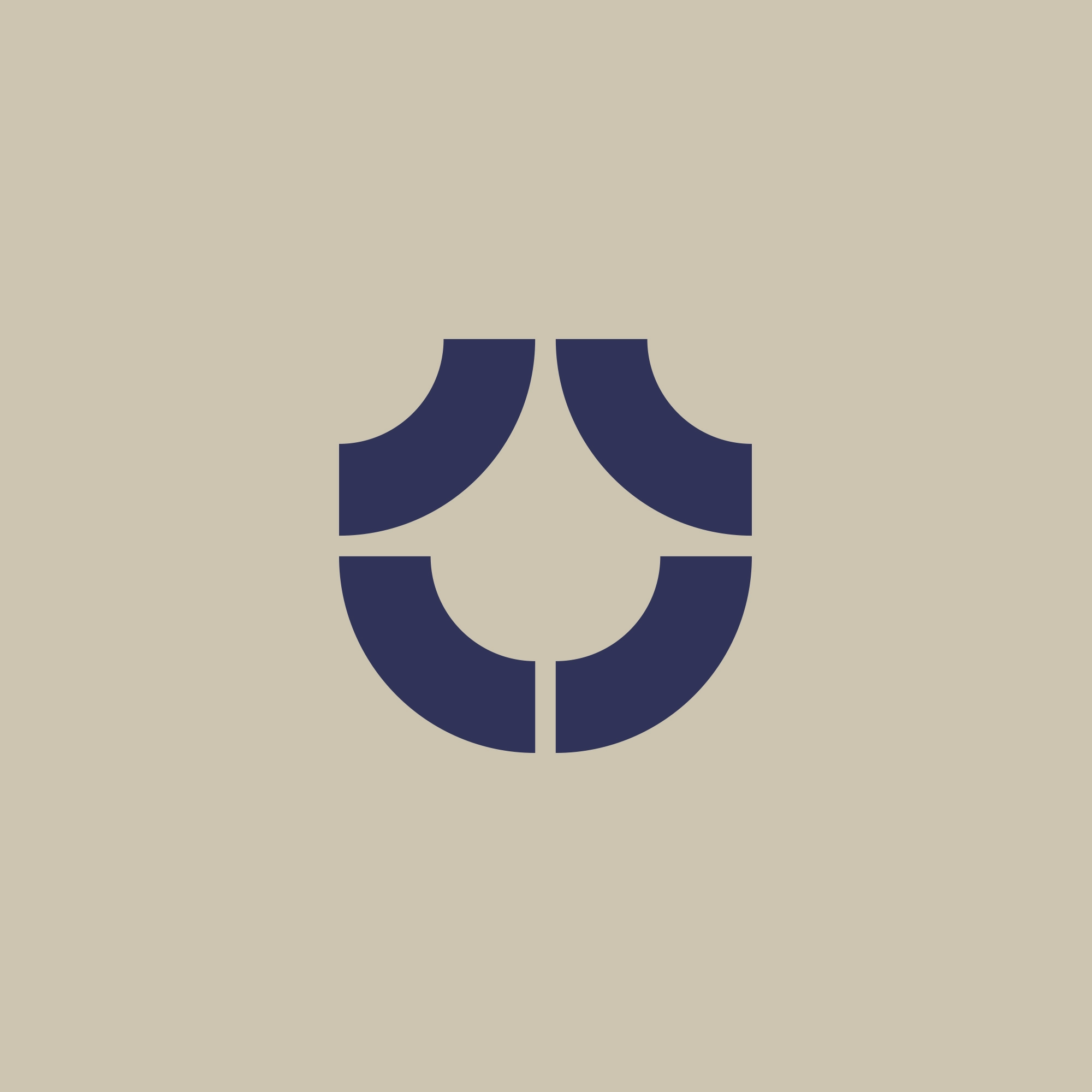
CoreMarine's former logo featured simple typography paired with an inverted water drop. Our brief for their rebrand was to develop something that felt more ‘grown up’ than the simplistic logo that served them for their first eight years as they shifted from their fledgling startup phase to being an established, successful organisation with a global audience. The challenge was to design a logo that maintained a reference to their heritage water drop, while reflecting their new values and aspirations.
CoreMarine stressed the significance of the value of their own people over the company's commercial success. Their new brand needed to invoke feelings different to other engineering companies – feeling less corporate, more fun, a little playful, and a little radical.
We then needed to counterbalance these traits with the confident professionalism expected from a technology company operating on the world stage.
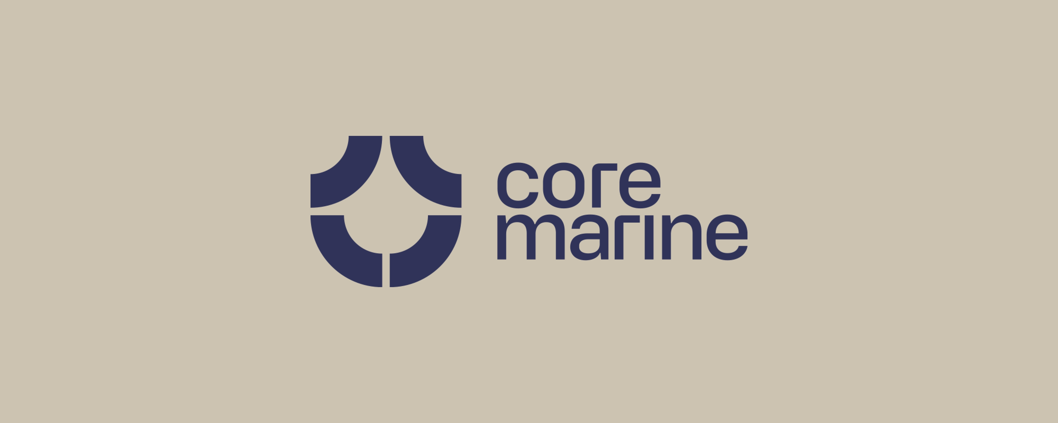
We maintained that connection to the brand's original logo by recreating a simple water drop in the negative space of four arcs. The arcs are also used as a simple pattern, bringing depth and personality to their branded material.
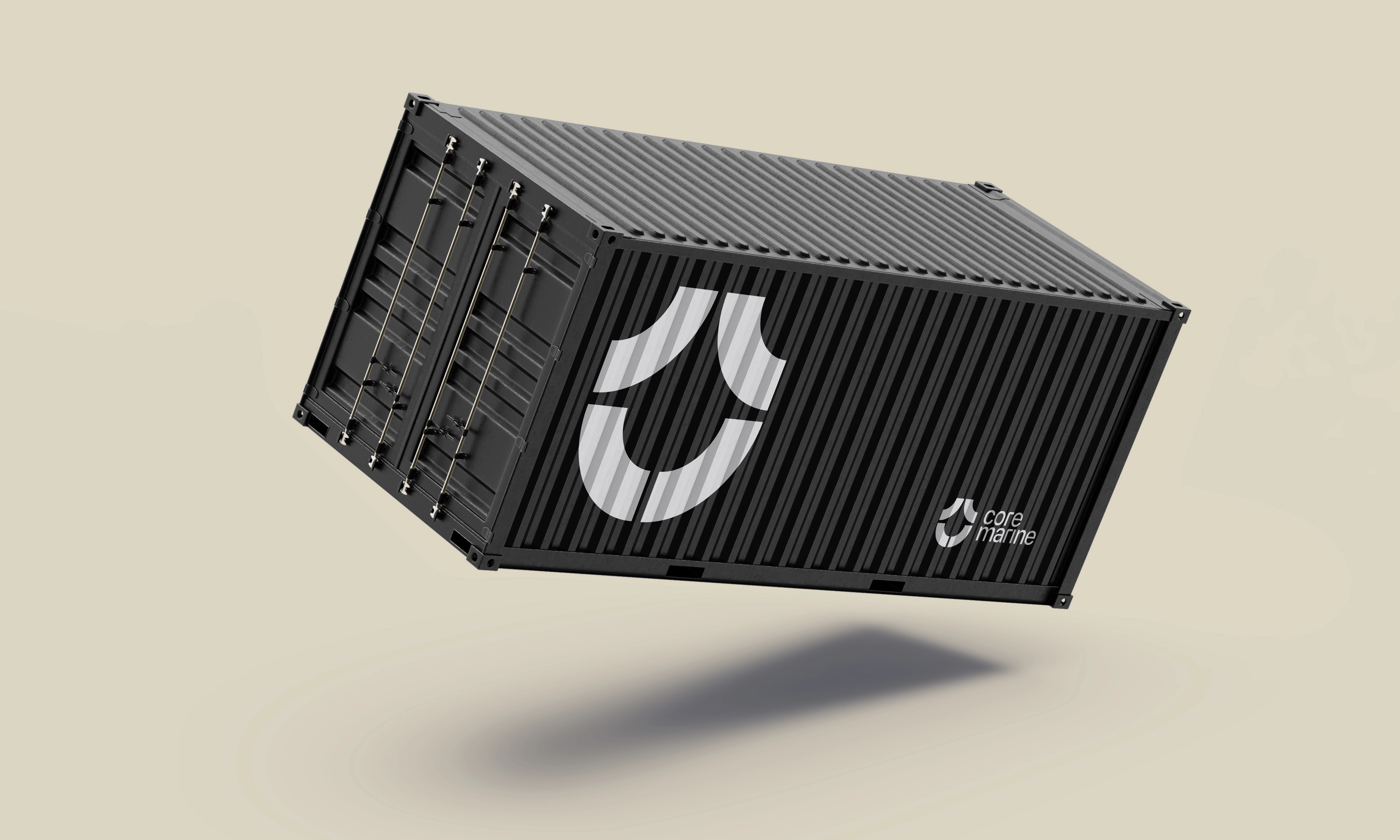
To give the brand a radical edge, we introduced a colour palette that stands out in a crowded marketplace of traditional “green energy” colour palettes against backdrops of stock wind farm imagery. CoreMarine’s sandy baseline is lifted by deep blue with neon highlights, helping to break down stereotypes and reinforce its brand as a progressive, disruptive, and fun contender in the world of ocean engineering and technology.
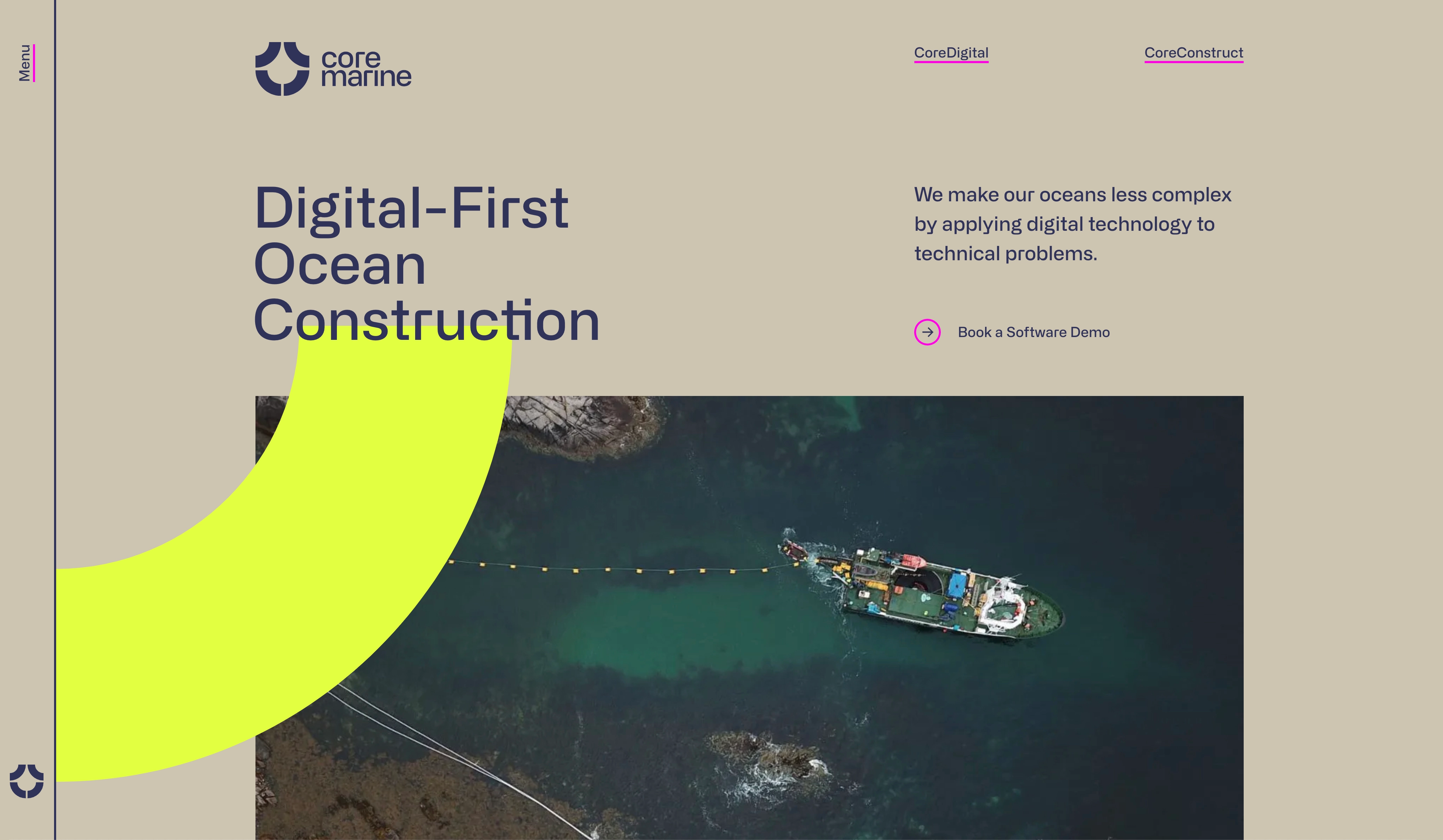
The CoreMarine website is a beautiful extension of their brand - simple, yet memorable and perfectly exemplifies the personality of the organisation itself.
Services
- Web development
- Web design
- Branding
- Art direction