Assembly 197
Brand
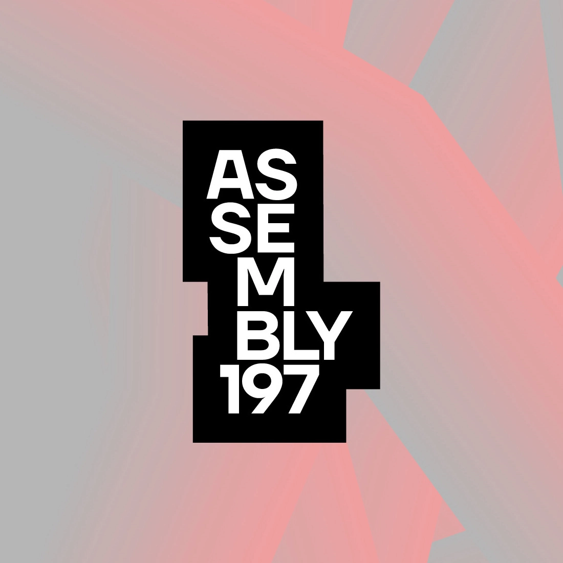
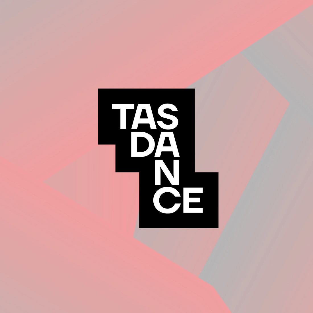
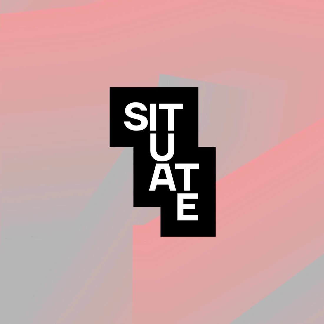
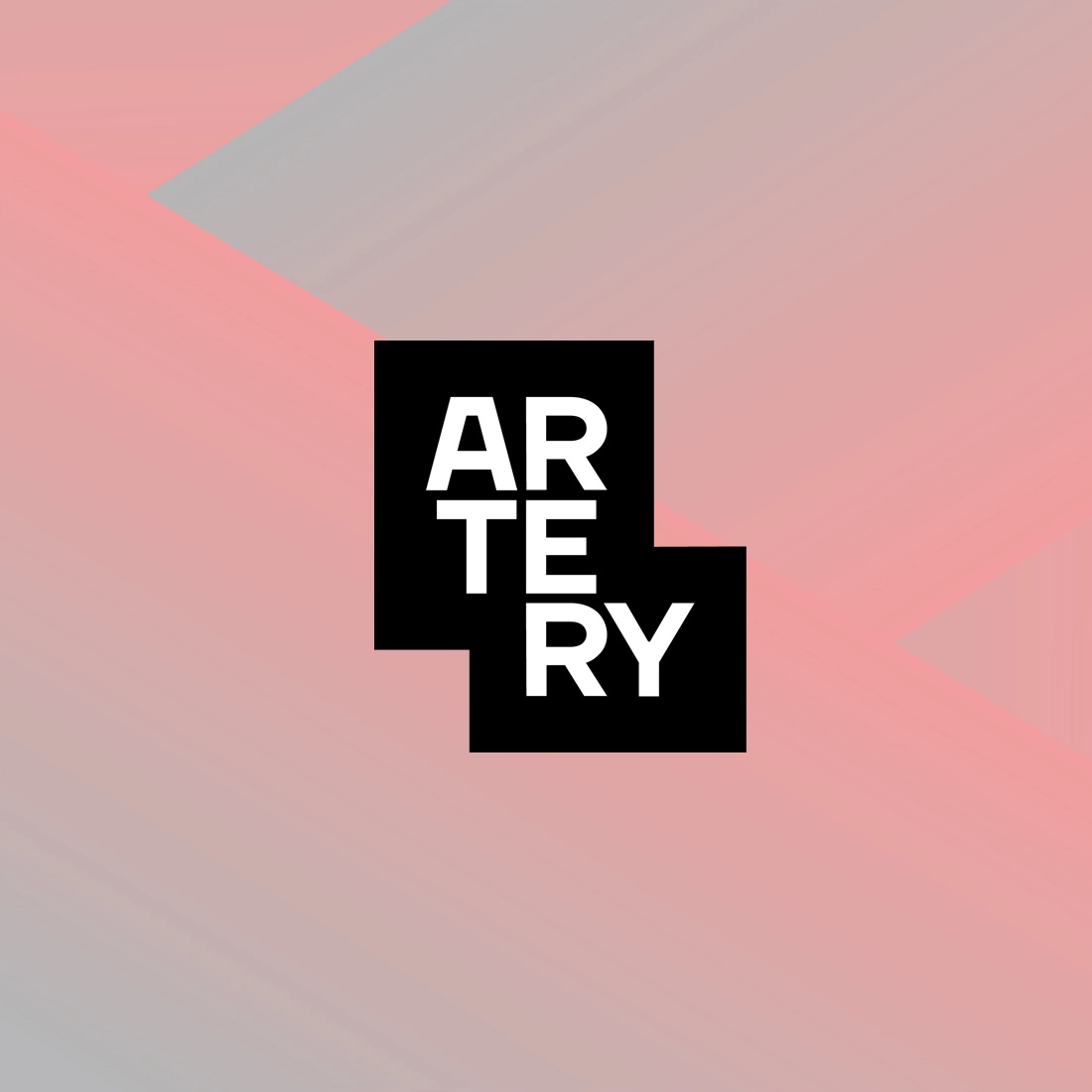
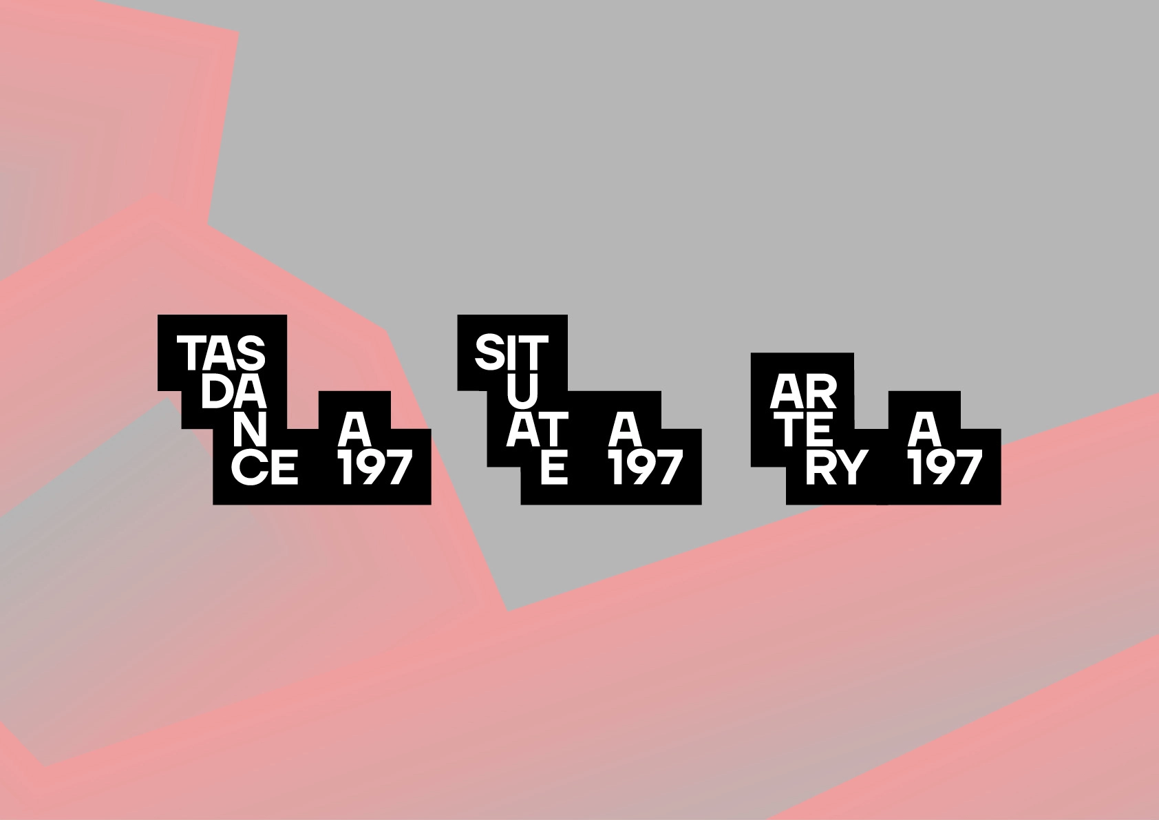
Assembly 197 is a fresh new cultural organisation combining Tasdance, Situate and Artery — all performance/live arts-based organisations that will still exist as sub-brands under Assembly 197. The organisation is based at a Tasmanian heritage property at 197 Wellington Street Launceston.
Assembly 197 engaged us to design a brand family, incorporating the parent and child brands.
In the discovery phase of the project, we identified the brand family needed to be “uniquely iconic and authentically cool”, and needed a “unifying font or graphic for each of the brands”.
In the design phase, we investigated many directions but weren't happy with them being unique, iconic, or cool enough. And we really wanted a direction that spoke strongly of the performance art the organisations are renowned for.
Experimenting with the typographic structure for each brand we realised that by stacking letters we were recreating abstract performing human forms, frozen in time. By applying consistent structure rules to each logotype and carefully finessing the placement of each letter were happy with the result. An A197 brandmark was also designed, which can be used for social media, and as an extension to the child brand logos to communicate their connection to Assembly 197.
Aware that live art oozes life and energy we created a dynamic pattern to use with the logotypes. This was created by mapping the movement of dancers in a performance, to bring a sense of movement, energy and to offset the somewhat static nature of the logotypes. We pulled the background block shapes of each logo out to be used in its own right as an additional branding device.
When used together, the logos, pattern and block shapes result in an instantly identifiable brand that's iconic, cool, and speaks strongly of the organisations it represents.
Services
- Branding
- Design
- Art Direction